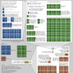
Nice (albeit a bit complicated) chart compares radiation doses from different exposures, graphically depicting what doses are considered “safe” versus “dangerous.”

Just another WordPress site
Nice (albeit a bit complicated) chart compares radiation doses from different exposures, graphically depicting what doses are considered “safe” versus “dangerous.”